Certain pairs of letters look better when the spacing between these letters is reduced or increased a bit. Such adjusting is known as kerning.
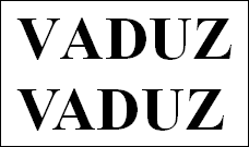
The following figure illustrates what is meant by kerning:

Above: without kerning. Below: with kerning
The upper text (without kerning) shows that the letters "V" and "A" are usually too far apart. This was corrected for the lower text (with kerning).
This adjusting occurs fully automatically. All you have to do is enable kerning:
Select the desired text, and click on the group arrow![]() in the bottom right corner of the ribbon tab Home | group Character. In the dialog box, switch to the Spacing tab and enable the option Use kerning.
in the bottom right corner of the ribbon tab Home | group Character. In the dialog box, switch to the Spacing tab and enable the option Use kerning.
Presentations now automatically adjusts the spacing between all letters where this would improve the text appearance.
Note: Not all fonts provide kerning information in their font data. This information is required to determine which letter pairs to adjust and how. Almost all font collections published by SoftMaker include extensive kerning information.