The chart type determines how data will be displayed in a chart – for example, as columns, bars, lines, etc.
To change the chart type, proceed as follows:
Directly via the icons of the command group "Type"
Many chart types can be used directly via the icons of the command group Type on the contextual ribbon tab Chart:
| 1. | Select the chart by clicking on it. |
| 2. | Click on the Chart type icon |
| 3. | Select the desired Chart type from the dropdown menu (see below for explanations of the different chart types). You may use the icon below it to select a Chart subtype (only available for certain chart types). |
Additional options via the dialog box of the command group "Type"
You will find some more options via the dialog box of the command group Type on the contextual ribbon tab Chart. Here, you can also survey the possible appearance of the chart in a preview.
| 1. | Select the chart by clicking on it. |
| 2. | On the ribbon tab Chart | group Type, click on the group arrow |
| 3. | In the dialog box, switch to the ribbon tab Chart type. |
| 4. | Select the desired Chart type and Subtype. |
| Tip: A small preview of the currently selected chart will be shown in the right half of the dialog box. You can enable or disable this preview at any time using the >> button or the << button. |
The following chart types are available:
![]() Column chart
Column chart
Column charts are a good way to compare values. Each value is represented by a correspondingly high column.
![]() Bar chart
Bar chart
Bar charts correspond to column charts; however, the values are displayed horizontally rather than vertically.
![]() Line chart
Line chart
Line charts display values as points and/or connecting lines.
![]() Area chart
Area chart
Area charts are line charts where the space between the X axis and the individual lines is filled with color.
![]() XY scatter chart
XY scatter chart
XY scatter charts display values as points and/or lines. Unlike line charts, the data area must contain both the X and Y coordinates of the data points.
![]() Bubble chart
Bubble chart
Bubble charts display values as filled circles ("bubbles"). Bubble charts are usually based on data series containing three values: X coordinate, Y coordinate, and bubble size.
![]() Radar chart
Radar chart
Radar charts display values in a web. The zero point is in the center of the web.
![]() Surface chart
Surface chart
Surface charts display values as a three-dimensional shape. Areas plotted in the same color indicate that they contain similar values.
The values to be displayed should have the following structure:
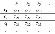
(Z values determine the height.)
![]() Pie chart
Pie chart
Pie charts are well suited to displaying the percentage of individual values of the total value. The size of each "pie slice" shows the ratio of the value to the total and to the other values.
Tip: You can highlight values by extracting the related slice of the pie from the pie. Select the slice of the pie and extract it via the mouse.
![]() Doughnut chart
Doughnut chart
Doughnut charts, like pie charts, show the percentage of individual values of the total value. Unlike pie charts, however, they can display any number of data series (rings) and not just a single series.
![]()
![]()
![]() Cylinder, Cone and Pyramid charts
Cylinder, Cone and Pyramid charts
Cylinder, Cone and Pyramid charts correspond to column and bar charts. However, they use cylinders, cones or pyramids instead of columns/bars to display the values.
![]() Stock chart
Stock chart
Stock charts (also known as general high-low charts) are suitable for displaying the development of stock prices, among other things. They enable the highest price, lowest price and closing price to be seen at a glance, for example.
The following subtypes are available:
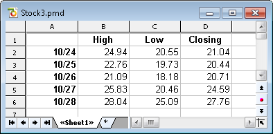
▪Stock chart (High, Low, Close)
| This type of chart displays the following values: highest price, lowest price, closing price. |
| It requires 3 data series in the above order. |
| An example of the possible structure of the data (with the date added in column A): |
 |
▪Stock chart (Open, High, Low, Close)
| This type of chart displays the following values: opening price, highest price, lowest price, closing price. |
| It requires 4 data series in the above order. |
▪Stock chart (Volume, High, Low, Close)
| This type of chart displays the following values: trading volume, highest price, lowest price, closing price. |
| It requires 4 data series in the above order. |
| The trading volume is displayed as an additional column with its own value axis. |
▪Stock chart (Volume, Open, High, Low, Close)
| This type of chart displays the following values: trading volume, opening price, highest price, lowest price, closing price. |
| It requires 5 data series in the above order. |
| The trading volume is displayed as an additional column with its own value axis. |
![]() Box plot chart
Box plot chart
Box plots (or box and whisker plots) are useful for data analysis in statistics. Detailed explanations relating to the application of box plots would go beyond the scope of this manual. You can find further information on them via your preferred Internet search engine.
There are two subtypes: Horizontal and Vertical.
Depending on the number of data series passed to the chart, different variants of box plots will be rendered:
Note: You can display any type of value in a box plot. The following lists show examples only.
▪3-point box plot
| This box plot displays, for example, the following values: |
| Lower quartile (lower border of the box) |
| Median (position of the line within the box) |
| Upper quartile (upper border of the box) |
| This box plot requires exactly 3 data series in the above order. |
▪5-point box plot
| This box plot displays, for example, the following values: |
| Lower whisker (line below the box) |
| Lower quartile (lower border of the box) |
| Median (position of the line within the box) |
| Upper quartile (upper border of the box) |
| Upper whisker (line above the box) |
| This box plot requires exactly 5 data series in the above order. |
▪7-point box plot
| This box plot displays, for example, the following values: |
| Minimum (as a single marker) |
| Lower whisker (line below the box) |
| Lower quartile (lower border of the box) |
| Median (position of the line within the box) |
| Upper quartile (upper border of the box) |
| Upper whisker (line above the box) |
| Maximum (as a single marker) |
| This box plot requires exactly 7 data series in the above order. |