Data series are the most important chart elements. They represent the data to be evaluated – in the form of columns, bars, lines, pie segments, etc., depending on the chart type selected.
A data series is the graphical representation of a column or row of cell values on which the chart is based. Each data series, in turn, consists of multiple data points, thus the individual cell values.
Changing properties: To change the properties of data series or single data points, proceed as follows:
▪If you click on any of the data points of a data series, the entire data series will be selected. You can now edit the properties of this data series by right-clicking on it to open the context menu and then choosing the command Series: Properties.
▪If you click on the same data point once again, only this single data point will be selected. The command in the context menu is then called Point: Properties.
Tip: Alternatively, you can choose these commands via the Edit properties icon  on the ribbon tab Chart | group Chart elements after you have selected the data series (or the data point). on the ribbon tab Chart | group Chart elements after you have selected the data series (or the data point). |
You can make the following settings:
Format tab
Tip: Borders and fill can also be conveniently adjusted directly via the buttons of the ribbon tab Chart | group Chart elements. For more information, see Editing chart elements.
▪Border section (or Line section)
| Here, you can change the line style used to draw the graph. To do so, use the option Custom to select the desired line style. The option None removes the line. |
| If you enable the option Shadow, the graph will also be highlighted with a shadow. You can use the Adjust button to make other settings for the appearance of the shadow effect. (For some chart types, the option Smooth line appears here instead, which enables you to give the graph a smoother gradient.) |
▪Fill section
| Here, you can change the fill of the data series/data points. Auto gives the fill area a standard color. The fill will be transparent if you use the option None. You can use the option Color to customize the color for the fill. The color for negative values can be assigned a different color for certain chart types. |
| If you select the fill type Effects and click on the Customize button, the program will display a dialog box that will allow you to also apply more complex fills (such as a color gradient). The use of this dialog box is described in Object properties, Fill tab. |
▪Marker section (available only for certain chart types)
| Some chart types (for example, certain types of line charts) draw markers for each data point. Here, you can customize the appearance of such markers. |
3D format tab
Note: The options on this tab are available only for certain chart types.
Use this tab to add a light effect or bevels to the data points to be displayed.
▪Material
| Here, you can select the material that should be simulated to display the data points. |
▪Light
| Here, you can select the type of light that should be simulated. |
▪Angle
| Here, you can change the angle of the light source. |
Tip: The above effects usually look better if you also use the following option to add bevels to the data points.
▪Bevels section
| Here, you can add a bevel effect to the graphical representation of the data points. If you apply these options to a bar chart, for example, the edges of the bars will be rounded. The larger the value, the rounder the edges will be displayed. |
Use this tab to add labels to the selected data points. This is useful, for example, if you want to have the exact values displayed for each data point.
▪Display section
| Here, you can specify the type of label to be displayed. The default option is Don't show, thus no label is displayed. If, for example, you select the option Show value, the value of the relevant data point will be displayed, while the option Show data point will display its name, etc. |
▪Display legend key in label
| If you enable this option, the legend keys of the relevant data points will be displayed before the labels. The legend key is a small square in the same color as the data point. |
▪Placement section
| Here, you specify where the label should be placed (relative to the respective data point). |
Note: If you label data points, you can also click on these labels in the chart. Thus, you can change their properties by selecting a different font or changing the text you want to display, for example.
The following program response also applies here: Clicking once selects all labels of a data series, while clicking again selects a single label.
Note: This tab is available only for certain two-dimensional chart types (including column, bar and line charts).
You can use this tab to add error bars to the data points of the selected data series. Error bars display the possible/tolerable error of the values in the form of a line with a short dash at the end.
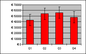
Chart with "Plus" and "Minus" error bars
To add error bars, select the desired type of error bar in the Display section: Plus only displays a positive error bar, Minus only displays a negative error bar, Plus and minus displays both error bars.
The option Show as lets you determine the appearance of the error bars: with or without short dashes at the ends.
In the Value section, you can change the length of the indicator line. If, for example, you select the option Fixed, the line will always have the specified length, while if you select the option Percent, the length will correspond to the specified percentage of the respective Y value, etc.
Error bar X tab
Note: This tab is only available for XY scatter charts and bubble charts.
This tab is identical to the Error bar Y tab (see above), except that it displays error bars for the X values instead of the Y values.
Helper lines tab
Note: This tab is available only for certain two-dimensional chart types (including column, bar and line charts).
You can use this tab to display various guides in the chart. If, for example, you enable the option Average, a dashed line indicating the average value of the selected data series will be displayed in the chart.
You can enable guides for Average, Minimum/maximum, Standard deviation, and Linear approximation (linear trend).
Tip: You can use the ribbon command Chart | Add chart element  | Add trendline to show other types of trendlines in the chart if necessary. For more information, see Trendlines.
This tab shows different settings for displaying the data series/data points, depending on the chart type, for greater clarification of the results.
For a line chart, for example, you will find the following settings:
Note: For other chart types, you will find different settings on the Options tab.
▪Displaying drop lines
| If you enable this option, lines will be drawn from the data points to the horizontal axis. |
▪Displaying high-low lines
| If you enable this option, lines will be displayed between the highest and lowest data points (for two or more data series). |
▪Up/down bars with gap
| You can use this option to display bars between the first and last data series, for example, in a line chart with two or more data series. In the input field below, you can also set the gap between the bars. |
For the above options, you can choose between different settings of the display in the section Empty cells are ... in case individual data points are missing.
If you select the option Vary color for each data point, the data points will be automatically colored with different colors (not available if there are multiple data series).
Tip: You can also format these chart elements, if enabled, by selecting them and right-clicking to open the context menu where you choose the relevant entry (Drop lines, High-low lines, Up/down bars): Properties.